Welcome to The Friday Face-Off, a new weekly meme hosted by Books by Proxy. Join us every Friday as we pit cover against cover, and publisher against publisher, to find the best artwork in our literary universe.
This week our theme is GATEWAYS, as picked by Lynn of Lynns-books. Or to put it another way, covers which features doors, portals, or any other means for a character to be transported from one place, dimensional, or world to another. And once I read the theme, only one book came to mind: Stephen King’s The Drawing of the Three. But there are so many variations on this books cover design, I couldn’t pick only two, so I’m giving everyone seven of my favorites to take a look at.
COVER A

COVER B

COVER C

COVER D

COVER E

COVER F

COVER G

AND THE WINNER IS . . .


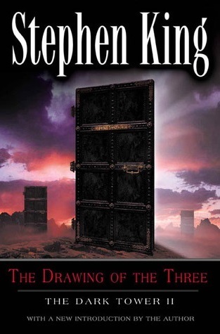
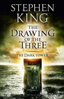
I have to say it was a tough pick for me because I also really like the ominous doorway and vibrant colors of Cover C, but ultimately, the dungeon-esque doors and creepy sky won out.

You can’t go wrong with any of these covers though. So which one is your pick?


The dungeon door is really cool but I’m going to have to choose cover C, I just really like the overall cover scheme.
I really struggled with this theme and look at all those doors, you even got a cover with 3 doors on it! Well played Sir. 😊
LikeLiked by 1 person
Glad you enjoyed!
LikeLiked by 1 person
Great choice! I love your winner – for some reason I’m drawn to cover D but your choice is very dark and foreboding – which would pretty much always draw me to a cover!
Lynn 😀
LikeLiked by 1 person
I’m really loving this new meme!
Very nice choice! I think I’m drawn to both covers C & D, but for different reasons – they both give off different ideas.
LikeLiked by 1 person
Nice pick! The second cover is a good one as well: the color is what makes the difference, IMHO
LikeLiked by 1 person
I like the cover you chose, but personally, I like Cover C the best. The colors in the sky and the water are awesome. And the fact that the door is on the water is kind of intriguing.
LikeLiked by 1 person
I would have liked Cover F if not for that horrendous purple text. Nice choice btw!
LikeLiked by 1 person
I will have to go with Cover C, actually! I love the colors.
LikeLike
Great book choice! I really like covers C and G – although the edition I read didn’t have any of these covers.
LikeLiked by 1 person
While I’m partial to the very first one because that’s the paperback series I initially owned, I do think the one you chose as the winner is the most intriguing. Was that style from large-sized paperbacks, or was that a hardcover series?
Check out my recent review of the book if you’re interested: https://leviathanbound.wordpress.com/2017/06/16/the-drawing-of-the-three/
Regards!
LikeLiked by 1 person