
 Book Traveling Thursday is a weekly meme hosted by Catia and Danielle. Each week everyone picks a book related to that week’s theme, then you write a blog post explaining explain why you choose that book and spotlight all the different covers from different countries. To find out more check out about BTT go to the Goodreads group!
This week’s theme is: A Book with Characters I Love to Hate!
There were more than a few books which immediately came to mind when I read this topic. Thomas Covenant. Prince of Thorns. But why settle for a book where I don’t like one or a few characters when there is a volume out there with dozens of characters I despise: A Game of Thrones.
ORIGINAL COVER
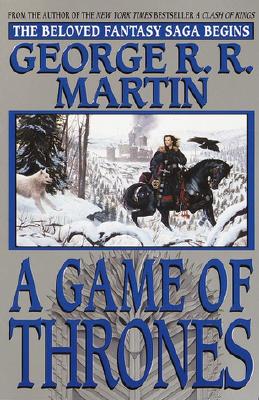
The book cover I recall when I first purchased this at my local store long, LONG ago. (Never would have dreamed this series would still not be finished.)
FAVORITE COVERS


I like these covers for different reasons. Left: Sure, it is a homage to the first season of the television show, but I like seeing a Stark on the throne. Middle: Black and white, classic, uncluttered look that appeals to me. Right: I’m a sucker for paintings of dramatic scenes, and you can’t get much more dramatic than walking toward the Iron Throne of Westeros.
LEAST FAVORITE COVERS


A few of these covers are terribly to me. Not only do they exhibit sub-par artwork, but they are so generic they fail to capture anything of the essence of A Game of Thrones. Several others are very minimalist, featuring only a sword, dragon head, throne, or wolf head. Nothing inherently wrong with any of them, but they are just fairly MEH to me.
So what do you think? Agree or disagree?


That’s a fun meme- I’ve never looked up the foreign covers of A Game of Thrones! I like the red one with the wolf head, but it’s definitely kind of generic. My favorites are probably the tv-edition and the minimalist one beside it. Which is funny because this series is anything but minimalist…
LikeLiked by 1 person
There were an endless number of covers for this book, which isn’t surprising due to its popularity, I suppose. Took a while to look at them all though. 😛
LikeLiked by 1 person
Covers that are “just a sword”, or a close-up of some armored clad torso annoy me. I think when they do that they are trying for an understated theme, but it just strikes me as so terribly unoriginal.
LikeLiked by 2 people
Yeah, they just blend in with everything else on the shelf. Cover art is suppose to make a book stand out, not fade into the pack.
LikeLike
I actually kinda like the red one at the end with the wolf. Other than that I am basically with you throughout.
LikeLike
Initially, I liked it as well, but the more I came back to it the more it didn’t appeal to me. Weird, I know.
LikeLike
Agree (for the most part) on the covers. One or two, I do like, but they don’t fit a series with the grandeur of this one. The first copy I owned is the same one you had – dear to me because of the nostalgia, but in all honesty, a bit Harlequin Romance-y.
Also, I really like the Japanese manga-style covers, just on an artistic level. I saw them once at a Japanese used bookstore, but they, alas, were a bit out of the price range.
LikeLiked by 1 person
I do own the first one (and also the third one on the second row of less-favorite covers – it was a gift) and I do love this one very much, if nothing else because this first book was an amazing discovery, back in 2002 when I first read it – and it marked my return to fantasy after a long, long absence. And yes, who would have imagined that 15 years after that firs discovery I would still be waiting to know how it all ended… (insert big sigh) 😀
LikeLiked by 1 person
Sadly my cover of this book is one of your ‘meh’ ones, but I didn’t choose it instead it was part of a boxed set of all the books, published so far, which I excitedly received a few Christmas ago from my dad 🙂
LikeLiked by 1 person