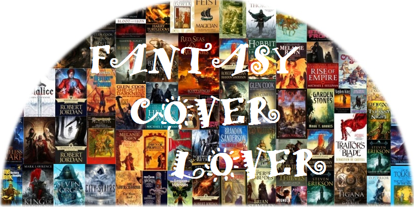
Today, I’m kicking off a new feature: Worst Fantasy Covers!
I know you can hardly contain yourself, but before you stop rolling your eyes, let me explain. See, I like compiling lists, so I began searching for 25 of the worst fantasy book covers ever produced. I found a few here, then a few there. Before you know it, I found my list approaching one hundred, but I still kept finding more books whose cover art struck me as absolutely horrified me for one reason or another. Since I had so many to choose from, I decided why try to categorize them or list them from bad to worst. I mean, I can just do an ongoing feature about this phenomenon of fantasy book cover madness!
You can thank me later. 🙂
Before I start let me set a few things straight.
First, I want to admit that covers do impact whether I purchase a book. Call me shallow if you want. However, if I see a novel with absolutely horrible cover art, I might not even take the time to pick it up and read about it. It doesn’t mean I never purchase a novel with an ugly cover, but it definitely doesn’t increase the odds of me picking it.
Second, I want everyone to understand this list is not going to focus on any certain epoch or style of artwork. Honestly, there is bad stuff from 2014 just like there is bad stuff from 1967.
And, third, please accept that this list is my thoughts and that there is absolutely nothing objective about it. I am not pretending there is. It is my own personal dislike of a fantasy novels cover. You are welcome to disagree with me. And please understand that some of the books I’m pointing out are my own favorite fantasy novels, so I am not showing any partiality toward even my favorites if their covers stink.
So with all the explanations out of the way, let us enjoy (or not) my first five nominations for Worst Fantasy Covers.
1. Morigu: The Desecration by Mark Perry (1986)

Some might say the cover is decent enough. Muscular guy wielding swords and bursting off the cover while his enemy looks on in the background. But take a look at the dude in the background. I swear, it is Don King.
Purchase the cover and all at Amazon.
Morigu: The Desecration
2. M.Y.T.H. Inc. In Action by Robert Lynn Aspirin (1990)

Okay, I believe this might have been a comedic fantasy novel, but the cover is really bad. So bad, I recall staring at it every time I passed it in my local bookstore wondering if I was having an acid flashback or something.
Purchase the cover and all at Amazon.

3. The Demon Awakes by R. A. Salvatore (1996)

The people in this cover look strange. Not only that but the whole scene looks really surreal or something. I can’t find the right word to describe it other than — bad.
Purchase the novel with a better cover at Amazon.

4. Lord Toede by Jeff Grubb (1997)
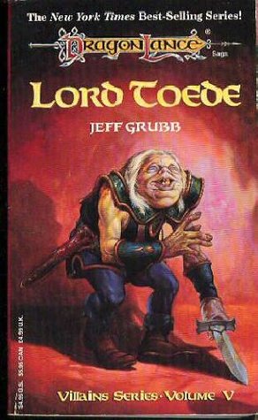
Do I really need to even say anything?
Purchase the cover and all at Amazon.

5. Mistborn by Brandon Sanderson (2007)

Before I had ever heard of Mr. Sanderson, I would see this book and wonder how a superhero story was in the fantasy section. Honestly, doesn’t the whole pose and cape thing just scream Wonder Girl or something.
Purchase the cover and all at Amazon.

Now, it is your turn. Nominate a few covers you disliked.


Really? I kinda like the Mistborn cover. Want a bad one? Look up Exile by Betsy Dornbush. It looks like The Rock on the cover in a bad eighties movie.
LikeLike
I’ll have to check that one out. The more I look for bad fantasy covers the more I find, but it is all a personal thing really. What works for me isn’t what works for everyone else.
LikeLike
Covers are important to me – I think they are a representation of the story within and should be treated with great care! So much so that I went on and on about it in a my own blog post. http://geekybooksnob.wordpress.com/2012/08/11/yes-i-judge-a-book-by-its-cover/
I’m with you on the covers and your list – I agree with all of them.
I really don’t like the most recent cover for the book The Thirteen by Susie Maloney – the woman looks like Michelle Pfieffer and yet the story is awesome. I almost passed it over because of the cover.
LikeLike
Thanks for the comment. 🙂
I agree. Fantasy covers DEFINITELY matter in my purchase of a book.
LikeLike
What really you thought Mistborn cover was bad!? I really like it. I do agree the cape was really unnecessary though. Those others make my eyes bleed!
LikeLike
Thanks for commenting. 🙂
I just thought Mistborn looked more like a superhero novel than a fantasy book. You have to admit that with that attractive, young lady standing in that epic pose with the cape going everywhere it looks like Superwoman or something. Plus, the dagger? in her hand is so small I never even noticed it until much, much later. Not “fantasy” enough for me, I suppose.
LikeLike
Yes I totally agree with you it looks very superhero. I’m all for super heroes though. I’ve enjoyed quite a few superhero themed books last year – so while I’d say yes misleading cover I still really like it! =P
Oh goodness yes that dagger is small! Ok so now you have to do a post “The most ‘fantasy’ Fantasy covers!”
*cackles* cause I have to see
LikeLike
Pingback: BEST FANTASY BOOK COVERS — PART 1 |
I agree about the Mistborn cover, but if you haven’t already you should look at the UK editions of all of Sanderson’s work. The Mistborn covers are beautiful
LikeLike