
Welcome to The Friday Face-Off, a new weekly meme hosted by Books by Proxy. Join us every Friday as we pit cover against cover, and publisher against publisher, to find the best artwork in the literary universe.
This week’s theme is: “ All that is gold does not glitter. A cover which features gold!”
I thought long and hard about this topic. I wanted to reveal an unexpected cover, but I kept coming back to the first book which came to mind. And, finally, I decided to stop fighting the feeling and just go with it already.
THE HOBBIT by J.R.R. TOLKIEN
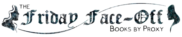
COVER A
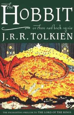
COVER B
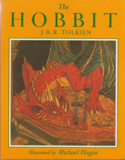
COVER C

COVER D
COVER E

AND THE WINNER IS . . .

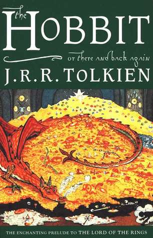
This really wasn’t a hard decision for me, because I have always loved Cover A. It is a personal favorite of mine; a classic fantasy covers which I feel perfectly captures the essence of Tolkien’s story.
Which would you choose? Why?
And, why not join in next week with your own selections.


I like that first one, but mostly because it has ‘there and back again’ on it. Was never a fan of the gold horde covers in general. All the smeary yellow makes me think of runny scrambled eggs.
LikeLiked by 1 person
That cover E made me laugh. Looks like someone on a bad trip did it. Do you know what language/publisher it is?
LikeLiked by 1 person
Not sure.
LikeLiked by 1 person
Brilliant! This is a great choice for “gold”! And I think you picked the best cover.
LikeLiked by 1 person
Great book and great cover! Although I also love cover D as that is the picture my special anniversary edition has on it 🙂
LikeLiked by 1 person
“My” Hobbit (not the first one I read, which was an old hardback, but the first I owned and read again and again) was the ’91 Grafton: with a very smug Smaug. I’m not thrilled by his expression, but he’s got some good scaly strength, and the gold is almost glowing. What puts this above others for me, though (other than nostalgia) is the strips of shiny gold paint at top and bottom, engraved with runes. Shiny gold AND mysterious!? What more could a boy want from a front cover?
Special mention should go to this ingenious Latin cover, which takes one of the classic designs and turns it into a tesselated Roman mosaic.
[but of course, the best Hobbit cover has no gold on it at all…]
LikeLiked by 1 person
I always think of the black 50th anniversary edition cover of the Hobbit, which had a very, very portly Frodo standing in front of a space alien Gollum. It’s adorably bad… and weirdly kind of awesome.
LikeLiked by 1 person
I love your choice – between the two of us I wanted to use this book – but I’m keeping it up my sleeve in case I need to wheel it out later. 😀
LikeLiked by 1 person
Aww, the old copy I own isn’t featured on here, but in lieu of that, I like your favorite too! 😀
LikeLiked by 1 person
I’ve rarely seen a cover for The Hobbit which I don’t like – but your choice is definitely my favourite. Such a charming illustration and that gold on the rich green background…. love it! 😀
LikeLiked by 1 person